Finger Clickin’ Good
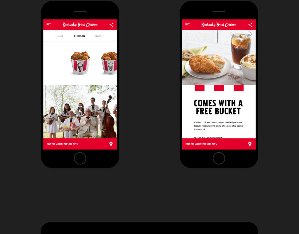
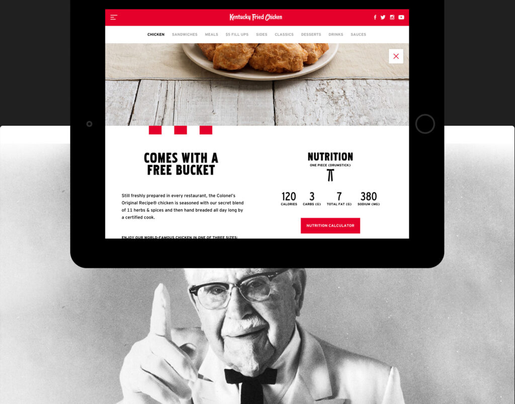
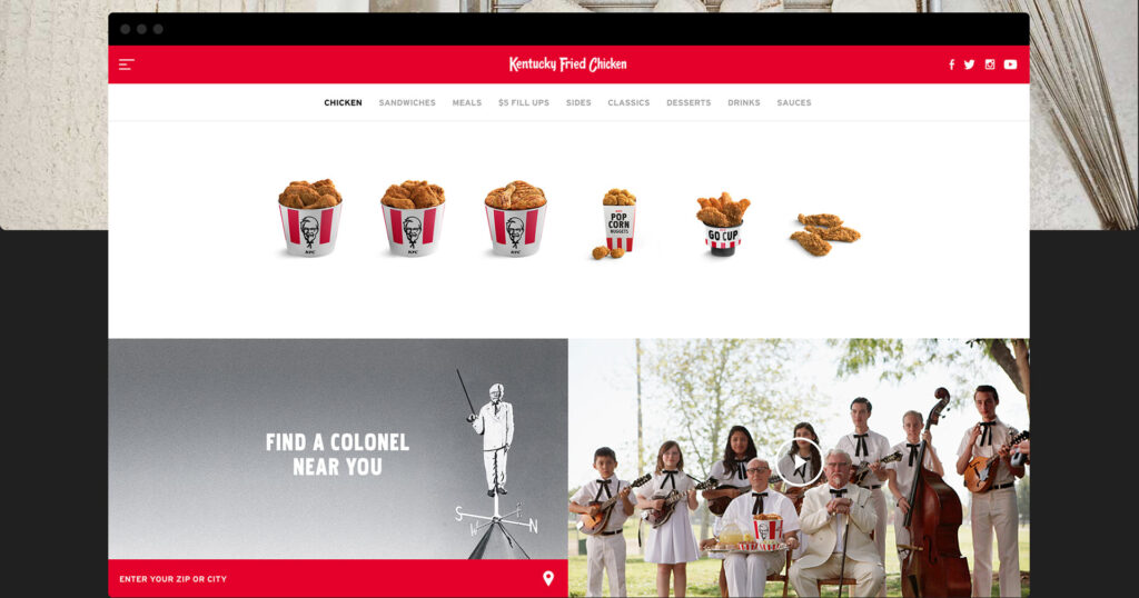
The new KFC site is a key component of their larger brand redesign. We balanced a throwback aesthetic with a modern interface, resulting in an adaptive, app-like experience. As a result, the key functions of the site stand out while remaining fully indexable by the search bots.
Services
User Experience
Design
Development
Recognition
AWWWARDS
Designer News
Site Inspire
Launch
Simplifiying The Experience
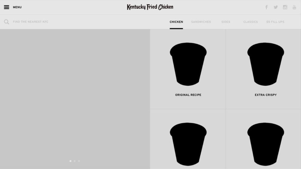
At project inception, it was important to nail down the main use cases of why someone would use a fast food website. So, we immediately began prototyping possible UX patterns. This was our first pass on the experience.
Laying Out The Pages
While Wieden+Kennedy was busy shooting pictures of chicken and writing content, we were laying out all of the pages and coming up with alternatives to a hamburger icon.
